Tuesday 28 June 2016
Final Submission
Mash-up
Sketch perspectives (one point, two point)
36 custom textures
Mash-up
Creating the “perfect” space is an impossible, and subjective, balancing act between form and function, particularly when addressing the visual expression of the layering of history within older buildings. Additions should be sensitive yet contemporary insertions into existing settings, with scars from buildings’ former lives retained and contrasted with contemporary interventions. These new structures gain richness from the addition of new layers into the life of existing buildings, and are designed with the future life of the building in mind, to stand the test of time and remain robust. A well-designed space must also be versatile yet appropriate for its main use, and must not dictate to the individual how they should perceive, operate or feel in the building, but have the flexibility to explore and experience it for themselves. Openness to the landscape and a relationship to the outside are also vital, as occupants of the architecture can observe the activity and the natural world outside, and those outside have a glimpse of what’s happening inside. This is welcoming, open, and transparent, separated yet connected, keeping communities together.Overall, the power a building has over a person is limited. It cannot change their personal needs or circumstances, and its uses are always changing, but a deep appreciation of human character and its capacity for transformation—due to fluctuating social and economic forces—allows for an understanding of the integral role of time.
Gander, Kashmira. “How architecture uses space, light and material to affect your mood.” The Independent (April 2016), http://www.independent.co.uk/life-style/design/how-architecture-uses-space-light-and-material-to-affect-your-mood-american-institute-architects-a6985986.html (accessed May 17, 2016).
Marmot, Daniel. “Building on the Built: the Work of Jonathan Tuckey Design.” ArchDaily (May 2016), http://www.archdaily.com/787224/exhibition-review-building-on-the-built-the-work-of-jonathan-tuckey-design-london (accessed May 17, 2016).
Davidge, Tania. “Education design that welcomes you: Michal Cohen.” ArchitectureAU (April 2016), http://architectureau.com/articles/education-design-that-welcomes-you-michal-cohen/ (accessed May 17, 2016).


Lumion Files
Google Drive
SketchUp Warehouse
Theater chairs - Jim K.
ST-6 Homestead Series In Ground Picnic Table - Victor Stanley Inc.
Retail Fixture Display Concept by agcaddesigns.com - AGcaddesigns.com
Bookshelf - FrankH
Desk and chair with a computer - BlakeyBoy
Round Table with Chairs, simple - TommyK
Elementary Cafeteria Table and Chairs - Nate
Workshop Hutch - Steve S.
Construction Machine Workshop - Mehmet T.
Sketch perspectives (one point, two point)
36 custom textures
Mash-up
Creating the “perfect” space is an impossible, and subjective, balancing act between form and function, particularly when addressing the visual expression of the layering of history within older buildings. Additions should be sensitive yet contemporary insertions into existing settings, with scars from buildings’ former lives retained and contrasted with contemporary interventions. These new structures gain richness from the addition of new layers into the life of existing buildings, and are designed with the future life of the building in mind, to stand the test of time and remain robust. A well-designed space must also be versatile yet appropriate for its main use, and must not dictate to the individual how they should perceive, operate or feel in the building, but have the flexibility to explore and experience it for themselves. Openness to the landscape and a relationship to the outside are also vital, as occupants of the architecture can observe the activity and the natural world outside, and those outside have a glimpse of what’s happening inside. This is welcoming, open, and transparent, separated yet connected, keeping communities together.Overall, the power a building has over a person is limited. It cannot change their personal needs or circumstances, and its uses are always changing, but a deep appreciation of human character and its capacity for transformation—due to fluctuating social and economic forces—allows for an understanding of the integral role of time.
Marmot, Daniel. “Building on the Built: the Work of Jonathan Tuckey Design.” ArchDaily (May 2016), http://www.archdaily.com/787224/exhibition-review-building-on-the-built-the-work-of-jonathan-tuckey-design-london (accessed May 17, 2016).
Davidge, Tania. “Education design that welcomes you: Michal Cohen.” ArchitectureAU (April 2016), http://architectureau.com/articles/education-design-that-welcomes-you-michal-cohen/ (accessed May 17, 2016).
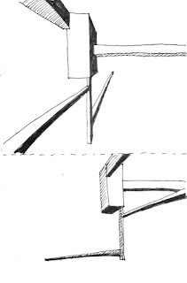
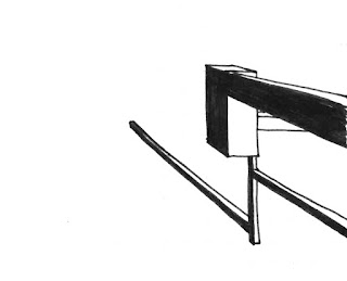
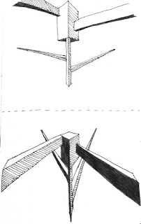
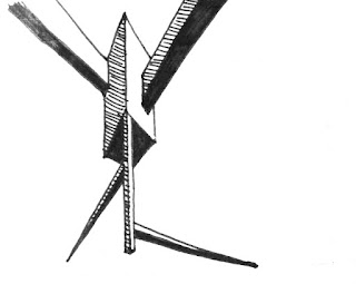
Simplified theory: the arc and the line
Chosen Perspectives
One point
Two point/SketchUp
Chosen Textures


Plan/Section + Inspiration + Draft Model Images + SketchUp
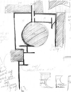
Plan/Section - inspired by Mies van der Rohe's Brick Country House
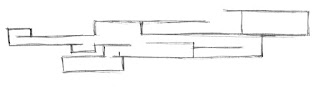

Draft 1/SketchUp


Further inspiration: SANAA's Glass Pavilion at the Toledo Museum of Art & Rolex Learning Centre, GAD's Hangzhou Phoenix Creative Building
Draft 2/SketchUp
Plan/Section - inspired by Mies van der Rohe's Brick Country House
Draft 1/SketchUp


Further inspiration: SANAA's Glass Pavilion at the Toledo Museum of Art & Rolex Learning Centre, GAD's Hangzhou Phoenix Creative Building
Draft 2/SketchUp


Final Images
(Extra images are the ones w/out long captions, there are 5 with long captions)

(Extra images are the ones w/out long captions, there are 5 with long captions)


Exterior aerial view - the form of the building is a combination of the 'arc' and the 'line' of the Roundhouse and Squarehouse respectively, referencing the theory in that aspects of both these buildings are recreated in the new addition to create a 'sensitive yet contemporary insertion'.

Research space for staff

Offices for administrative staff

Meeting space for staff

Moving element 1 - the first moving element is located along the passage connecting the two modules of the staff area. It consists of two sliding panels which can slide across (as shown in the video below) to both obscure staff areas for more privacy and to create an open air walkway. This alludes to the theory as it allows occupants to adjust and redefine space for themselves.

Ground floor gallery space

First floor gallery space

Meeting space for students

Moving element 2 - the second moving element is located on the student meeting area courtyard. It is a 'shell' which moves vertically to either create an envelope for the study area or to expose it (as seen below). This reinforces the theory in a similar way to the first moving element, as well as allowing for an adaptable connection to the surroundings.

Library

Lecture theatre

Computer space - instead of a typical computer lab, the computer space is open and continuous, creating a space that does not strictly define itself and therefore allows occupants to have the 'flexibility' to define its use and explore it for themselves.

Ground floor studios

First floor studios - the expansive use of glass throughout the building was both inspired by the sources mentioned above and a reference to the mash-up, which states the importance of a connection to the landscape and outside, and a sense of transparency. The building allows for a two-way connection - from students to the outside and from the outside to the students, reinforcing this element of the theory.

Mezzanine studio

Workshop
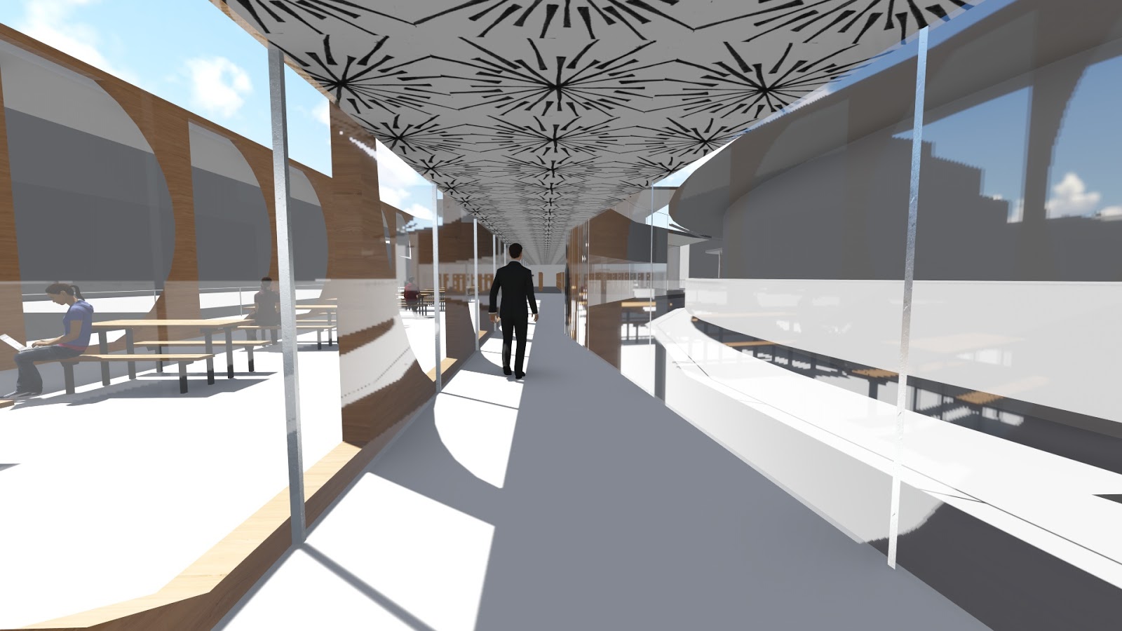
Hallway from gallery to library
Google Drive
SketchUp Warehouse
Theater chairs - Jim K.
ST-6 Homestead Series In Ground Picnic Table - Victor Stanley Inc.
Retail Fixture Display Concept by agcaddesigns.com - AGcaddesigns.com
Bookshelf - FrankH
Desk and chair with a computer - BlakeyBoy
Round Table with Chairs, simple - TommyK
Elementary Cafeteria Table and Chairs - Nate
Workshop Hutch - Steve S.
Construction Machine Workshop - Mehmet T.
Sunday 26 June 2016
Friday 24 June 2016


Monday 13 June 2016
Inspiration
Glass Pavilion at the Toledo Museum of Art, SANAA


Rolex Learning Centre, SANAA


Hangzhou Phoenix Creative Building, GAD


Rolex Learning Centre, SANAA
Hangzhou Phoenix Creative Building, GAD
Tuesday 24 May 2016
Plan + section + model progress
Plan:

Section:

Possible moving elements - choose two?
Blue - covering/shading element - changes light quality?
Green - circulation element
Red - facade wrap


Subscribe to:
Posts (Atom)